Research Project: Proprietary Assessment Tool, Avanade, Inc.
Situation
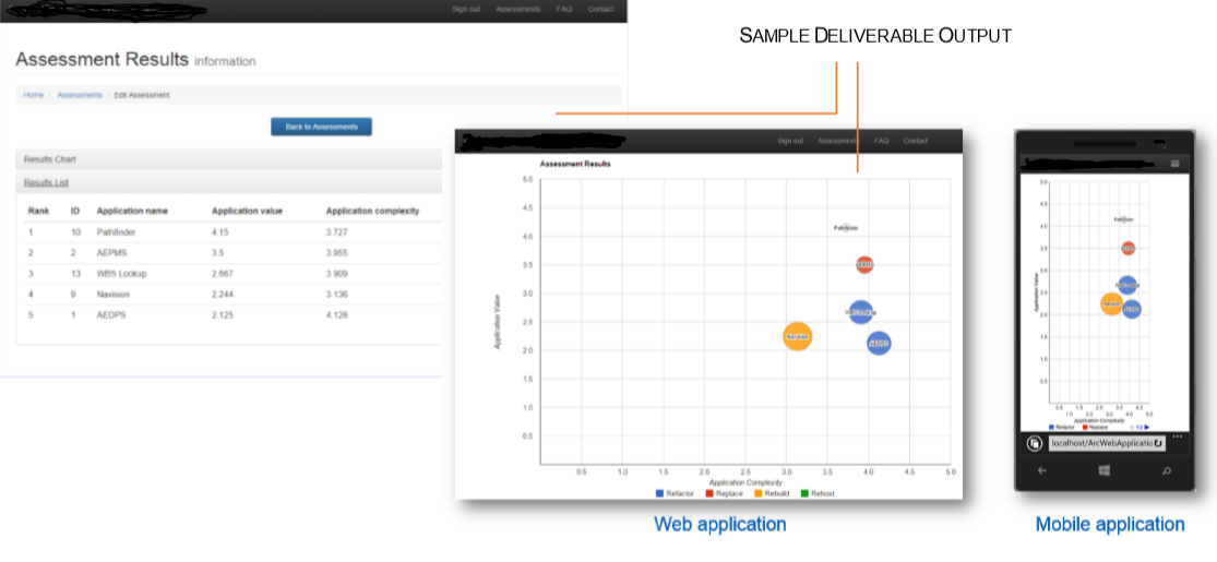
An internal team working on cloud projects built a tool to help clients figure out if they were ready to migrate to the cloud. I was originally pulled into the project to test and validate survey responses within the tool, and to rewrite UI text connected to survey results and subsequent recommendations for clients.
Issues and work process
- In the course of this work, I found critical usability errors within, and I proposed to the project lead that my scope expanded to do a study to identify and then recommend fixes that would improve ease of use and discoverability.
- I conducted stakeholder interviews, and then carried out a full heuristic evaluation and cognitive walk-through of the application. I analyzed the output of this work, and then defined the top five design and usability patterns of concern, and made rewrite suggestions for onscreen copy, graphic design, UI labels, and navigation changes.
- Finally, I wrote up and presented my findings to the team.
Outcome
- The project team implemented a majority of my recommendations, and this new iteration has been successfully deployed in the field, with a three-fold update in use of the tool by Business Development Executives.
- The tool and workshop attached to it has been very successful in winning deals and extending engagements with both new and existing clients.
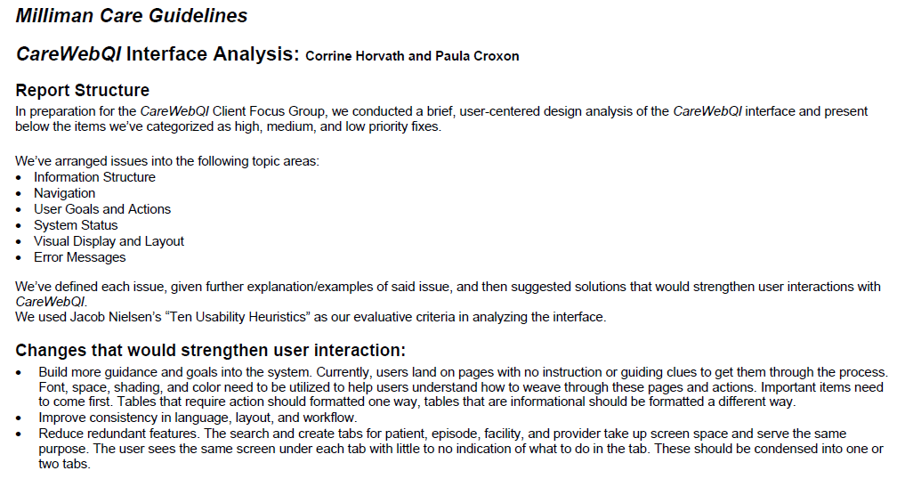
Content Usability Analysis: CareWebQI, Milliman Care Guidelines
Situation

- In early 2009, Millman Care Guidelines (now doing business as MCG Health) launched a proprietary web application to leverage their medical guidelines at the point of care.
- The application incorporated vital Recovery Milestones from the clinical content of the guidelines with individual patient caregiving records and recommended next steps in care.
- Testing for the beta CareWebQI app took place in the first quarter, with select users.
Issue
Beta users reported limited success in leveraging the web app.
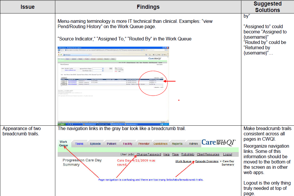
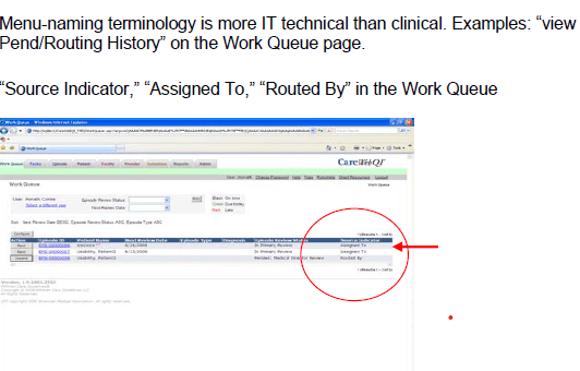
- Many found it difficult to follow the step-by-step procedures.
- Users found the inconsistent and overly technical language employed throughout the UI flow increased confusion on how to effective leverage the evidence-based content.
- UI elements (such as CTAs) and labels were inconsistent between different screens, and there was a lack of clear navigational elements for users to leverage.
- In April/May 2009, I was tasked with conducting a content evaluation (along with the Product Manager) of the entire CareWebQI interface, using expert heuristic usability assessments and criteria.
Goals for the work
- Carry out comprehensive heuristic content and usability analysis of the web app, using the guidelines set out by the Nielsen Norman Group and specified by the Interaction Design Foundation.
- Compile and categorize all findings by severity of issue and suggested solutions.
- Create a report for stakeholders and leadership with the research findings and make high-level recommendations for next steps and actions to improve the app.
Work process and actions
Research, analysis and definitions:
- I leveraged a heuristic evaluation template found on the Nielsen Norman Group (NNG), long considered the industry leader for research-based, results-driven UX guidance and training.
- The evaluation was based upon the six major usability topics (Information structure, navigation, user goals and actions, system status, visual display and layout, error messages.)
Heuristic content and usability evaluation:
- We worked through each UI flow in the app and recorded the issue, findings, and made suggested solutions to each issue.
- Upon completion, I wrote the report outlining each issue, where it occurred in the user flow, and made change recommendations to strengthen user interactions.
Outcomes
- This heuristic evaluation led to many small changes in the CareWebQI interface that increased overall usability.
- In addition, this evaluation was low-cost and the methods used applicable to other Care Guidelines products and future applications.
- We obtained valuable information about the new workflow module and stress-tested the robustness of the application, leading to bug fixes and process improvements.
- The company decided to hire a UI developer based partly on needs uncovered by these usability studies.
- The net effect of our report and results led to positive changes both in client relations, as well as the usability of the applications involved.
